Finding the visual identity of Plan.Make.Trace
The last post pulled the frontend back onto shared components. This one is about what those components look like, and the decision to stop changing it. Plan.Make.Trace now has a visual language, and every page, current and future, is built against it.
What we built
A visual language for the whole application. Colour, typography, iconography, spacing and the conventions for showing status, all defined once in the theme and the icon configuration, and consumed by every page rather than decided by it.
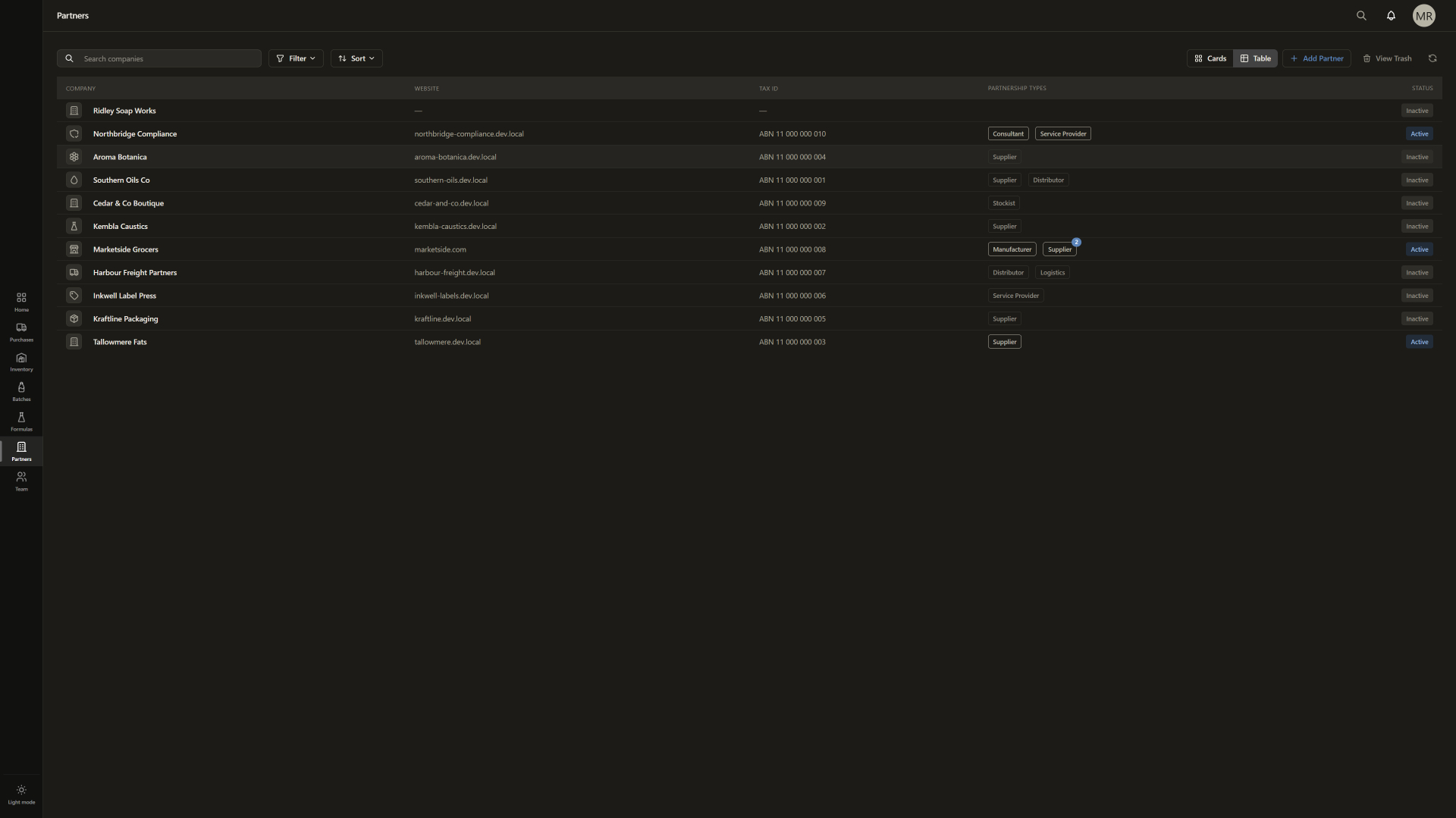
It comes in two themes, light and dark. Both define the same set of tokens, so the application looks like the same product whichever one you run.
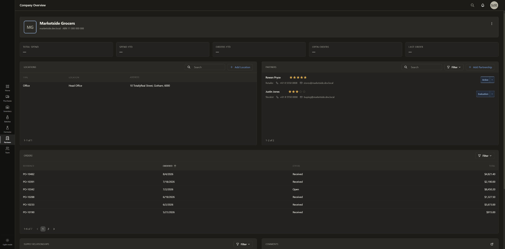
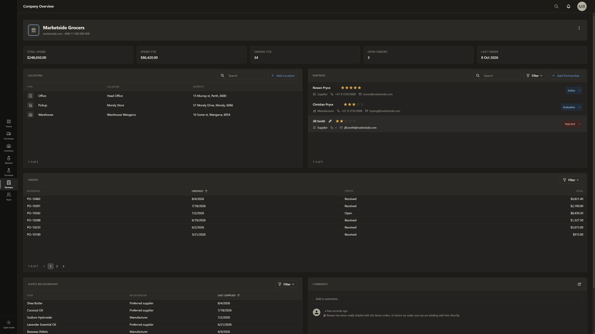
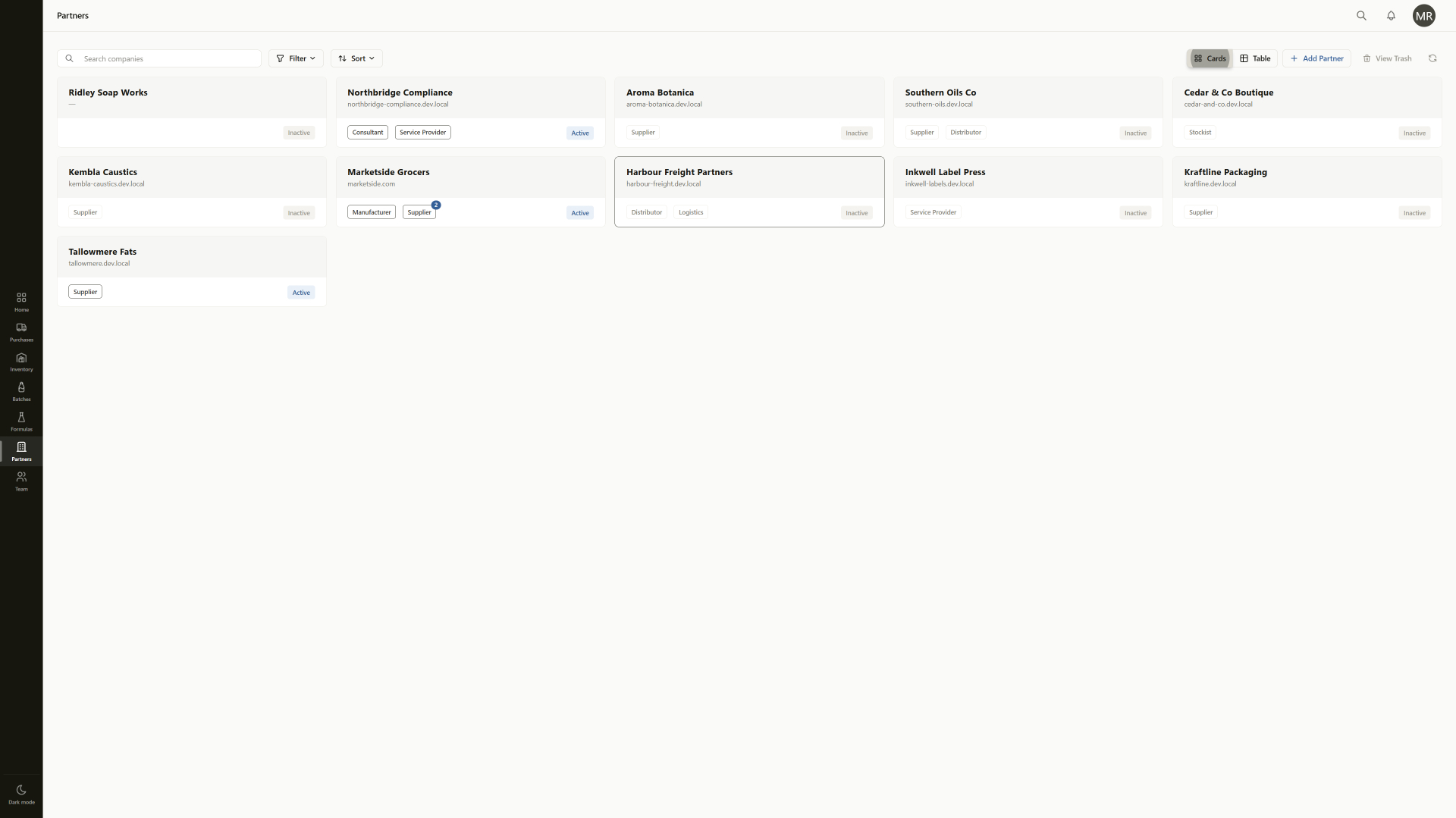
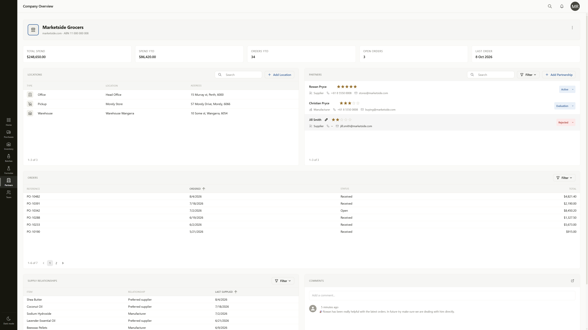
The Company & Partnerships screens are the first place the whole thing comes together, so they are the examples in this post. They are not the subject. The subject is the set of rules underneath them.
The problem it solves
Plan.Make.Trace is a data-heavy application. A single company profile carries locations, partnerships, orders, supply relationships and comments. A production batch will carry more. The interface has to make the important information stand out without drowning everything that supports it.
It also has to guide the eye. A screen should read in a meaningful order, not present thirty things at equal volume. And it has to hold up on everything from a phone to a wide monitor, and keep holding up as more information arrives over time.
Those are not questions you want answered again on every page. Answer them per page and every page answers them slightly differently.
The challenge: balance
None of this was hard in the sense of a bug. It was hard the way balance is hard. Every rule trades emphasis against calm, and the right answer only shows itself with the whole screen in front of you.
Colour is rationed. Structure, selection, table hierarchy and borders are carried by a warm stone neutral ramp. Blue is reserved for controls that perform a genuine action. Colour is spent where it carries meaning, which is status: active, on hold, stalled, complete, cancelled and failed each get a tone, and only the ones that need attention keep their saturation.
Typography gets the same treatment. Inter for text, and IBM Plex Mono for figures, identifiers, codes and lot references, so numeric columns hold their alignment. The heading scale stops at 24px and most headings sit between 15px and 20px. A data screen does not need its titles shouting.
The icons were the last piece of the puzzle. They support the data rather than decorate the page, and they are what made the whole thing feel complete.
A contract, not a style guide
A style guide describes how pages should look and trusts each page to follow it. That works while one person builds every screen and remembers every rule. It stops working the first time someone is in a hurry.
Ours is a contract. The theme is the only source of colour in the application. The light and dark themes are typed against each other, so a token defined in one and missing from the other fails the build instead of quietly rendering as nothing.
Dark mode is not the light theme inverted. In light mode a status chip sits on a pale tint of its colour. In dark mode the same chip sits on a dark tint, because a pale block on a dark background glares instead of receding. The meaning stays identical. Only the way it is expressed changes.
Icons follow the same rule. There is one approved set, listed in one configuration file, the only place in the codebase that names the icon library. The database stores an icon's identity, a stable key such as "building", not the icon itself. The frontend resolves that key through the approved set.
That makes an icon part of a record's identity rather than decoration a page picks. Location types, partnership types, inventory categories and companies each carry their own icon, and it appears the same wherever that record shows up. Users choose one through an icon picker in the form. A key is never removed once a record might hold it: a retired icon is marked deprecated, keeps rendering where it is stored, and drops out of the picker. Swapping the icon library is a change to one file. It is not a data migration.
The icon field was added in the Plan.Make.Trace domain models. Dawnshard did not change.
What this unlocks
Every page built from here inherits all of it. A new collection page, a batch record, the formula workspace: none of them make a visual decision. They compose the shared components from the last post, and the visual language comes with them. Building a page is now a functionality job.
It also means the real application is finally on the marketing site. The Company & Partnerships screenshots on the homepage are the running app, in both themes.
And it means we are done with it. The visual language is frozen for MVP. It reopens for a genuine usability problem or a showstopper, and nothing else. Polishing an interface is a bottomless pit, and every hour spent in it is an hour not spent on the features soapers are actually waiting for.
What's next
Back to functionality. The formula workspace: oil selection, ingredient weights, recipe steps, and the property results the saponification and prediction engine produces. It is the first major screen built entirely against the frozen visual language.
Liked this post? Tap the heart to let us know.
Get early access
Be the first to hear about early access, roadmap updates, and exclusive early adopter pricing.
Join the early access list